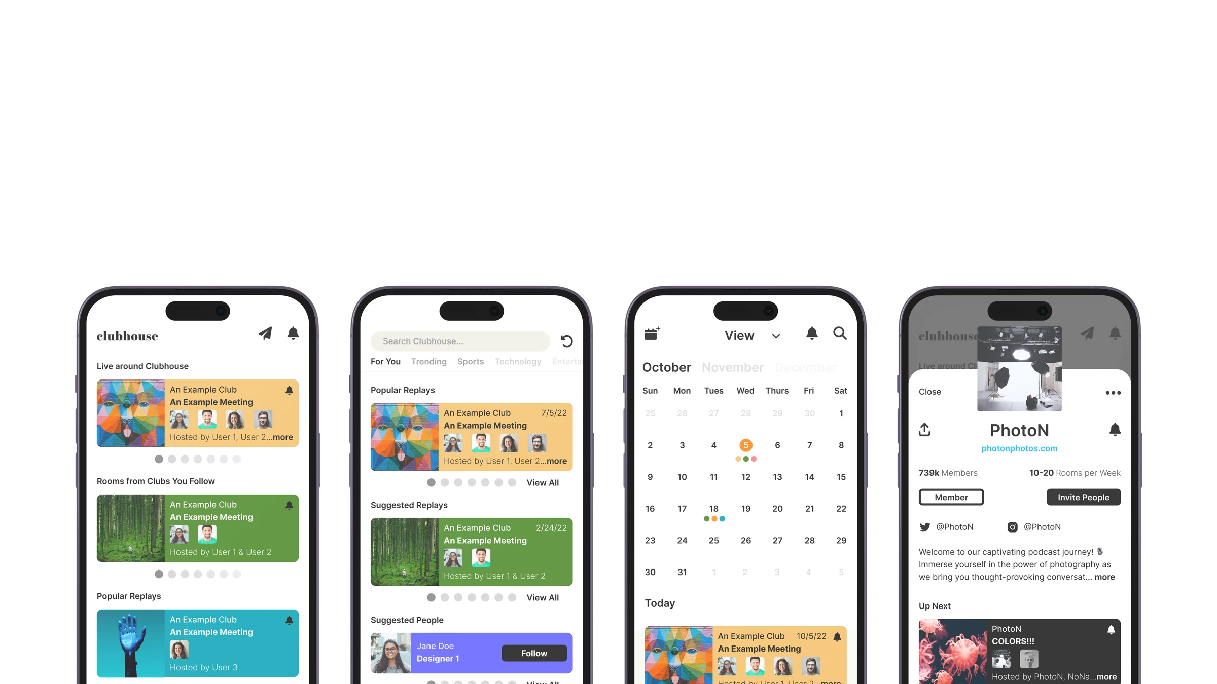
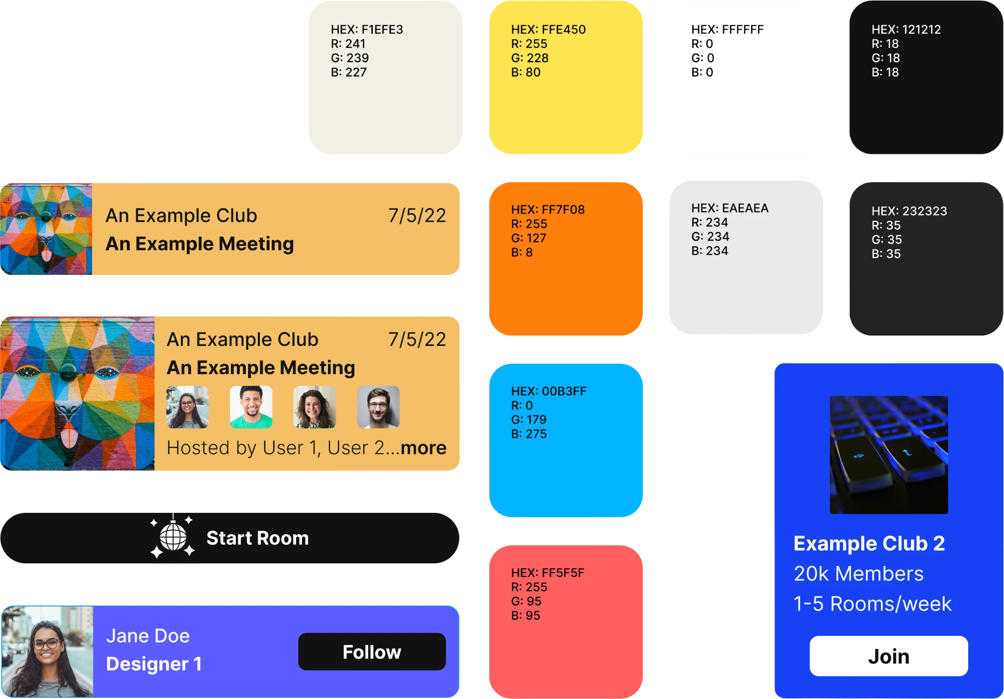
To create syntax, I developed interchangeable components that could be switched out between different screens. Because of the difficulty in differentiating between all the rooms on the homepage, I created a specific color palette for the app — this way, users would have a choice between which color is used, but still be confined to certain colors.
This added separation but still maintained syntax throughout the app. The component system gave the design enough flexibility to scale to new room types without sacrificing visual consistency.
There was also a lack of focus on clubs, their content, and the user's interests. So, I decided to add a tab to the bottom bar navigation and create a section where the user could find their favorite clubs easier. Surfacing this content earlier in the journey reduced the need for the user to dig through the search experience.
Later, I researched the main needs of users with wearable devices and linked them to the main uses of Clubhouse. By using Apple's Human Interface guidelines, I developed a wearable UX/UI design that could be paired with the main program — making it possible to listen, react, and switch rooms without picking up the phone.
The final design demonstrated how a small set of guiding principles — a shared component library, a constrained color system, sharper navigation, and a paired wearable — could meaningfully lift an audio-first community without redesigning the whole product from scratch.