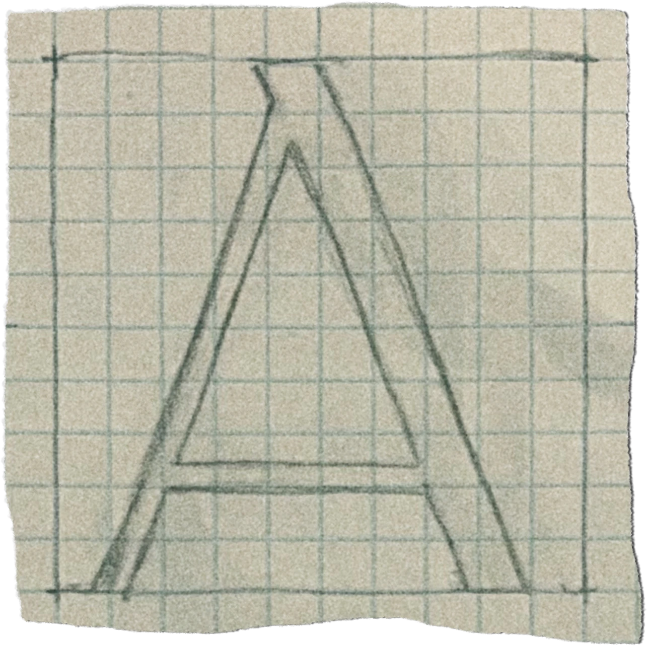
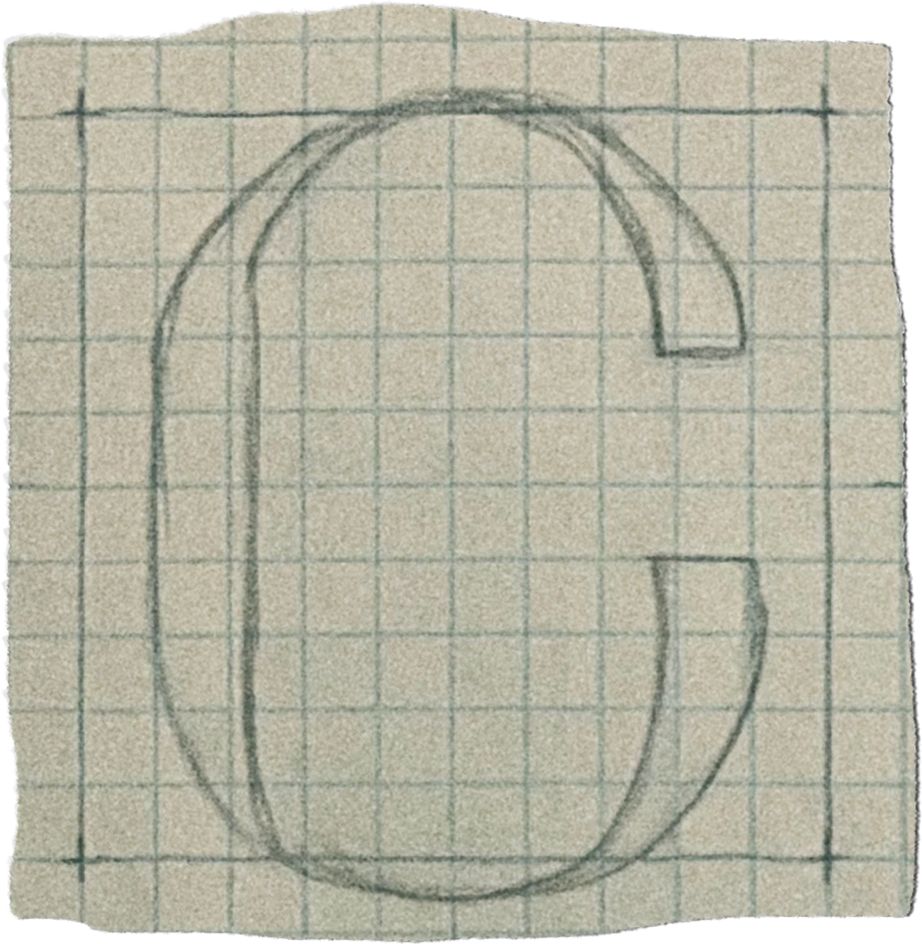
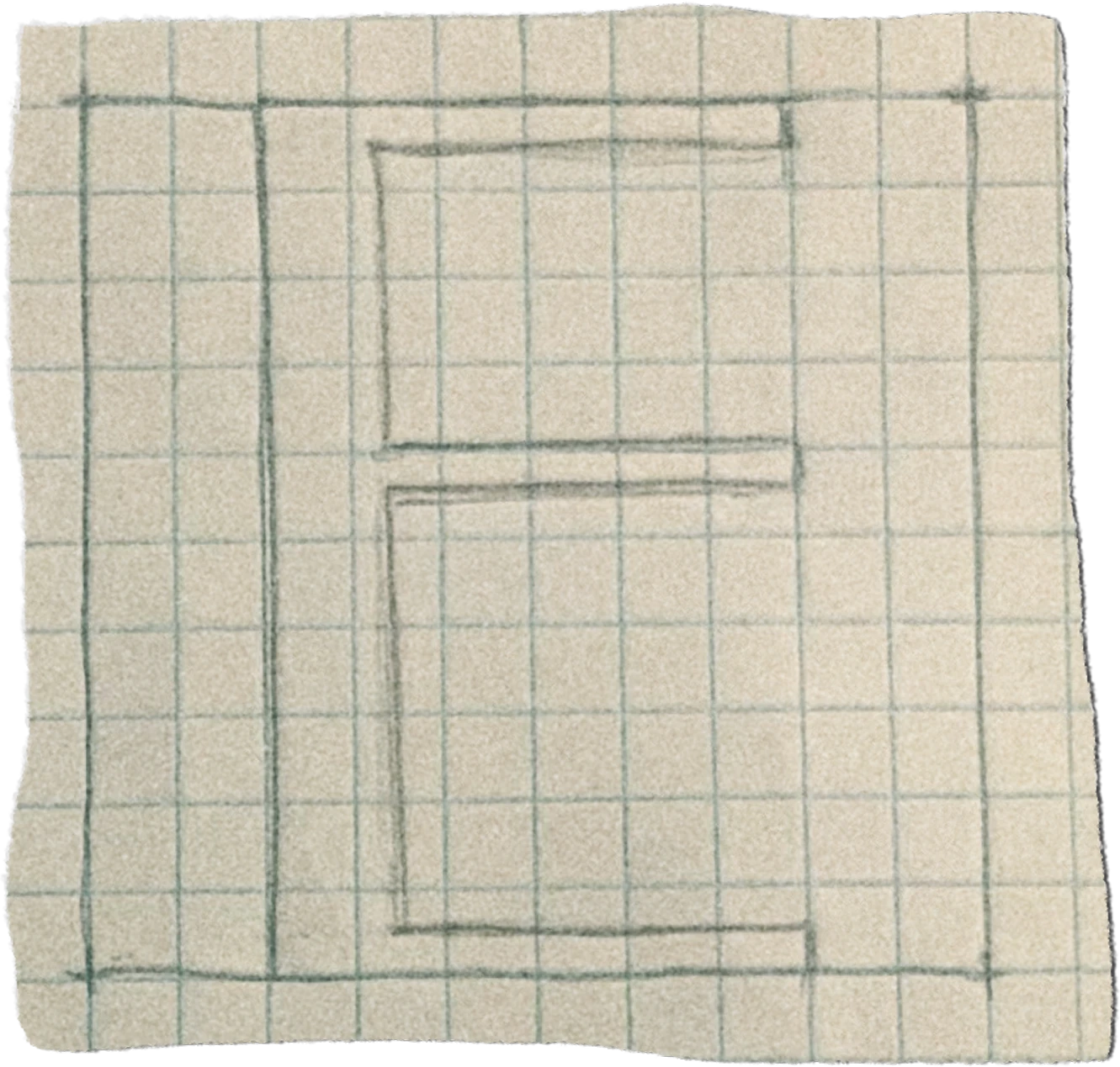
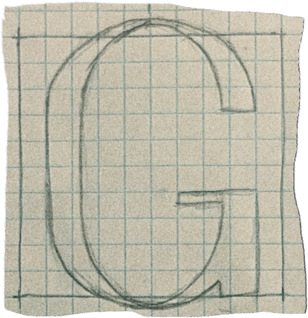
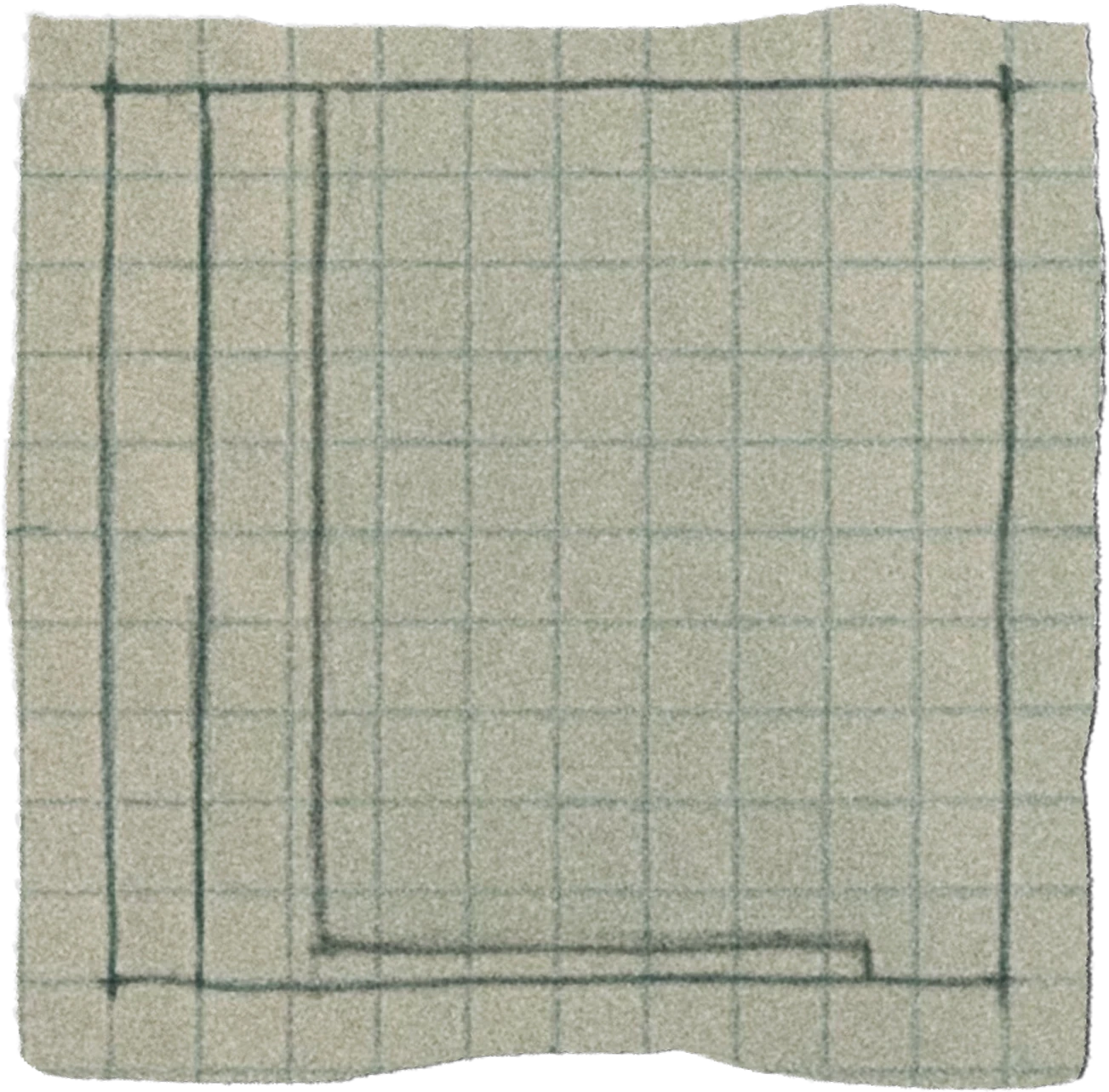
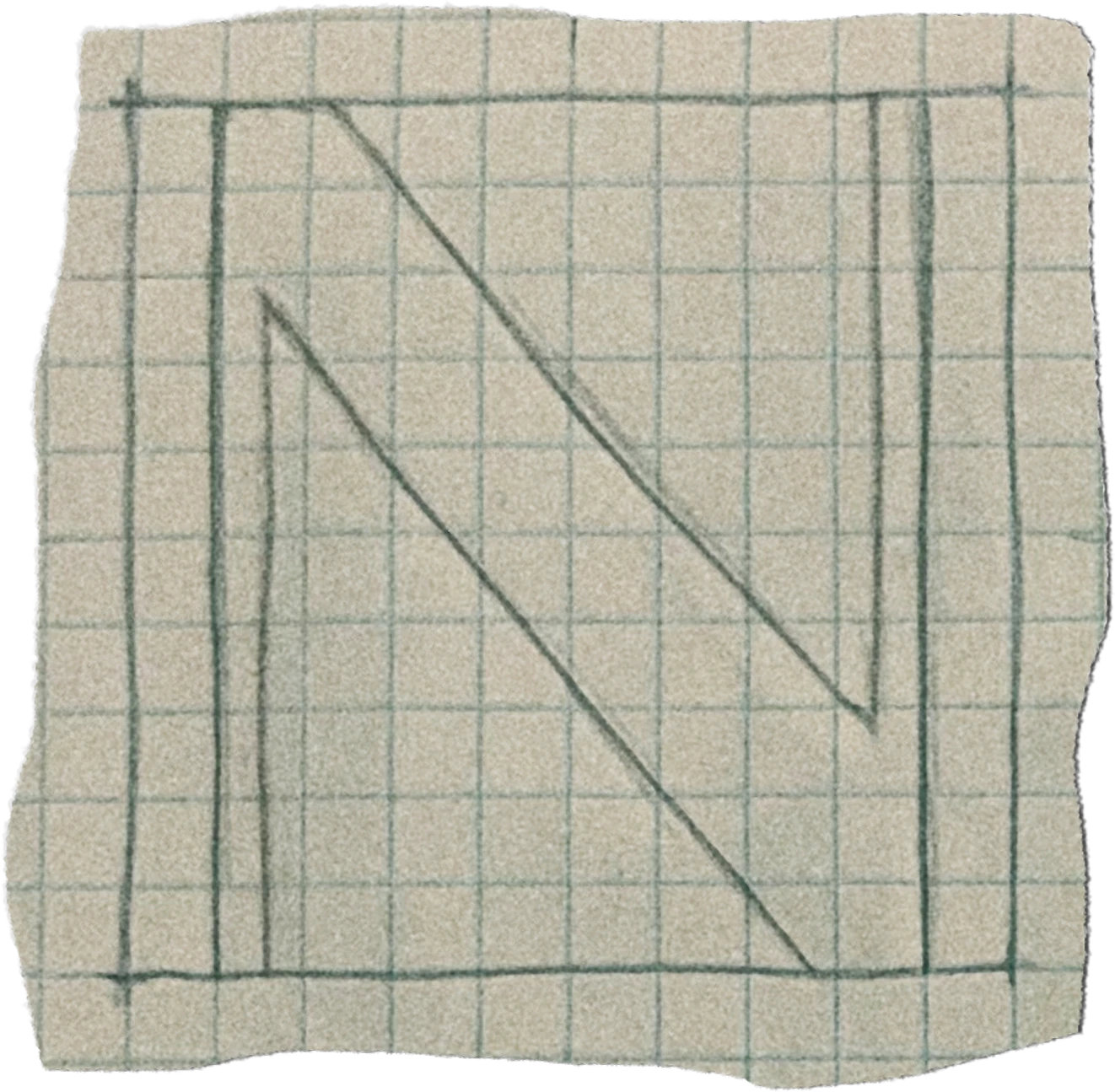
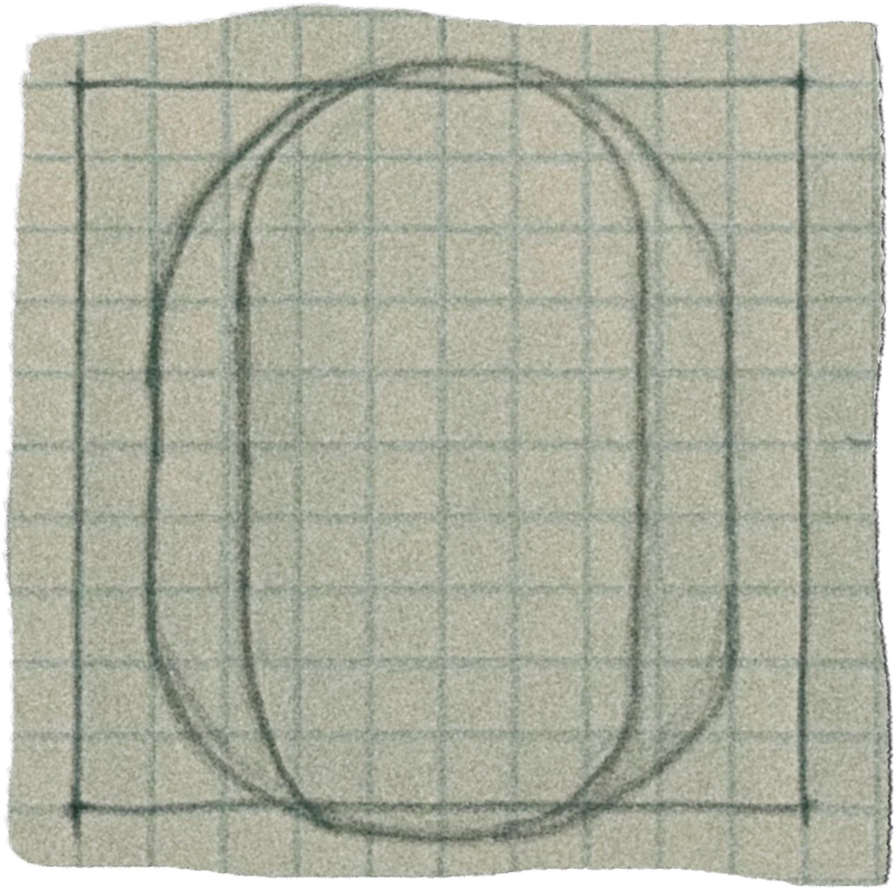
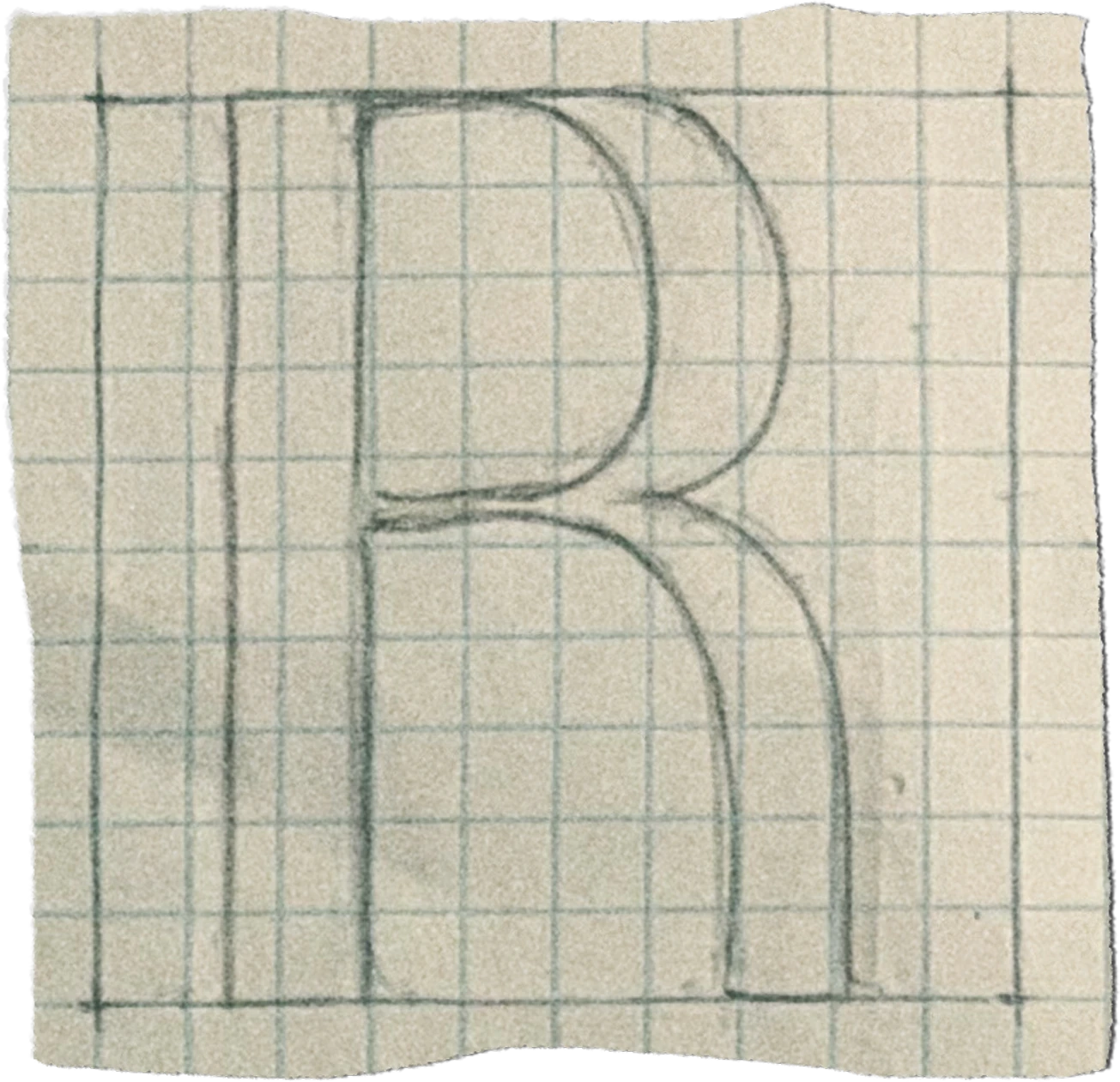
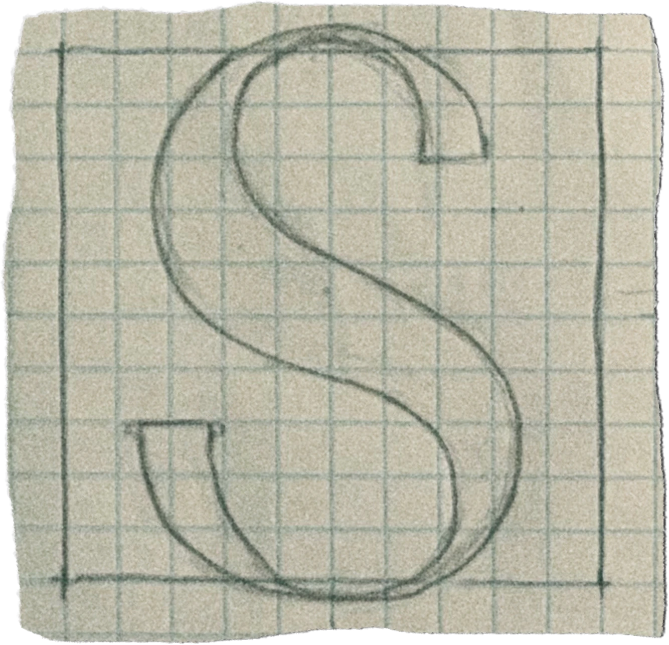
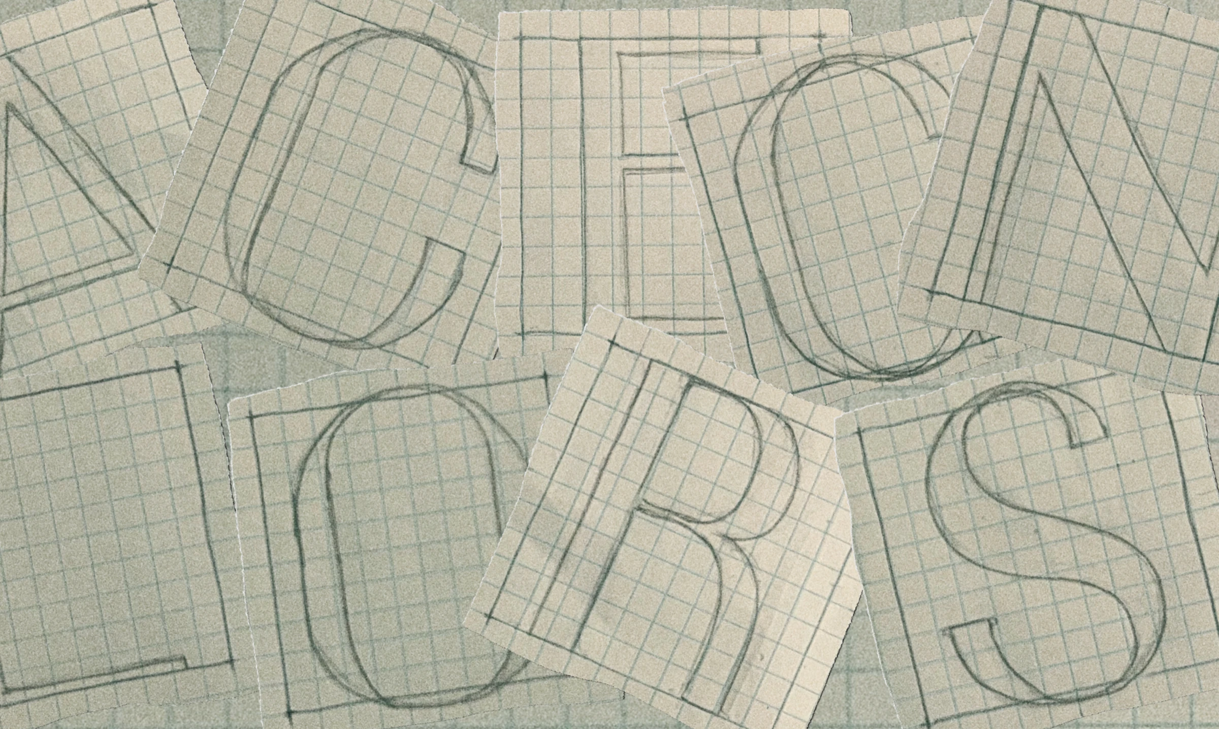
After looking through their initial ideas with the client, I moved on to sketching the letters composing their names in the business name: A-C-E-G-L-N-O-R-S. Working letter by letter let me push for a custom feel rather than relying on an off-the-shelf typeface that wouldn't carry their family's character.
I then refined the sketches in Adobe Illustrator and produced three more iterations with subtle adjustments — tightening proportions, balancing weight across the strokes, and making sure each glyph held up at small and large sizes. The goal was to land on a system, not just a logo.
Once the foundation was in place, I started thinking of ways to manipulate it. I looked through old work and found a typeface I'd made earlier named Pin-Runner, which features a fascinating negative space between characters. After noticing this quality, I began to connect "cutting letters" with "snipping of hair" — and decided to lean into that as the conceptual hook for the word-mark.
After making a couple of edits to what the client envisioned, I concluded with the final word-mark and brand guidelines. The end result felt unmistakably theirs — a mark with personality, built to carry across signage, print, and short-form video without losing the family-shop warmth that started the brief.